Project overview
SK ID Solutions offers secure e-identity and digital signing services that are essential to e-Estonia and used daily by over 4 million people in 20+ countries. Given the high-security and technical complexity of their field, our team took on the task of understanding their needs to create a user-friendly platform. The project team included an analyst, UX/UI designers, developers, and a tester from Trinidad Wiseman.
Project goal
SK ID’s ordering system had usability issues, which led to user frustration, abandoned orders, and increased support requests. The goal of the project was to simplify the process, improve navigation, and make the experience faster and more reliable, ultimately increasing user satisfaction and reducing errors.
Understanding the problem
The goal was to identify the main problems users faced with self-service and the ordering process.
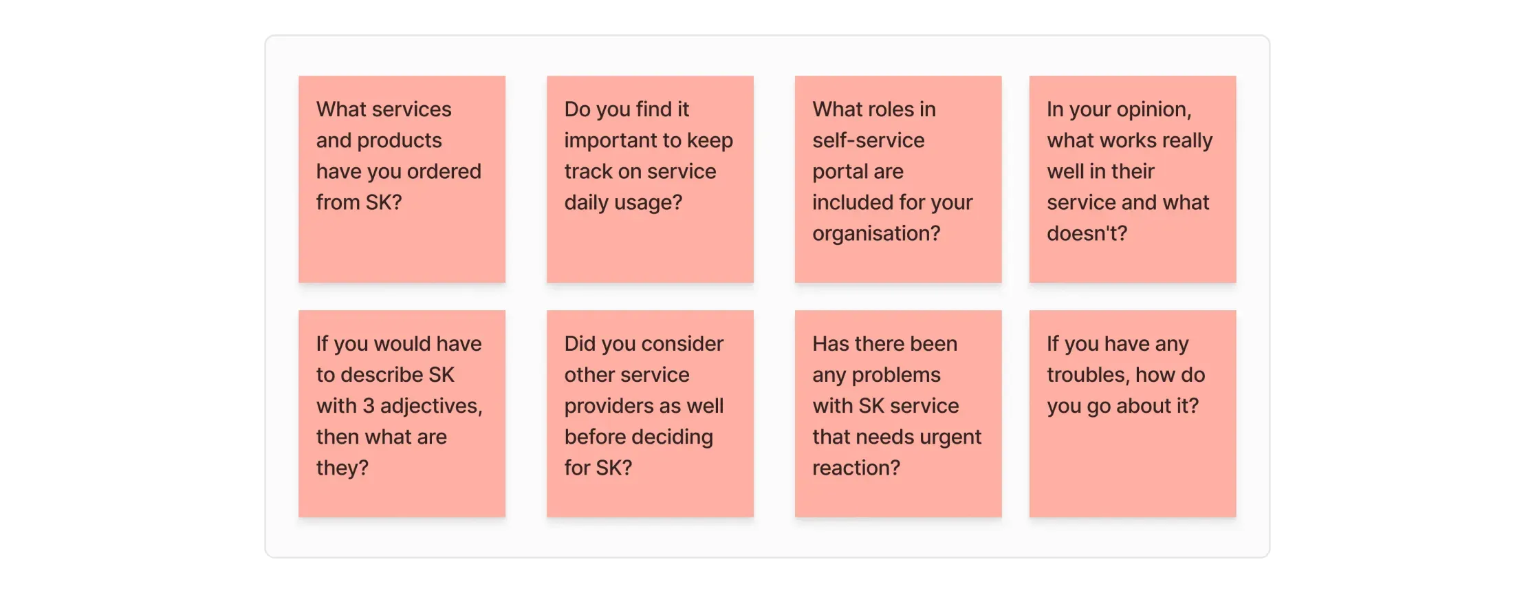
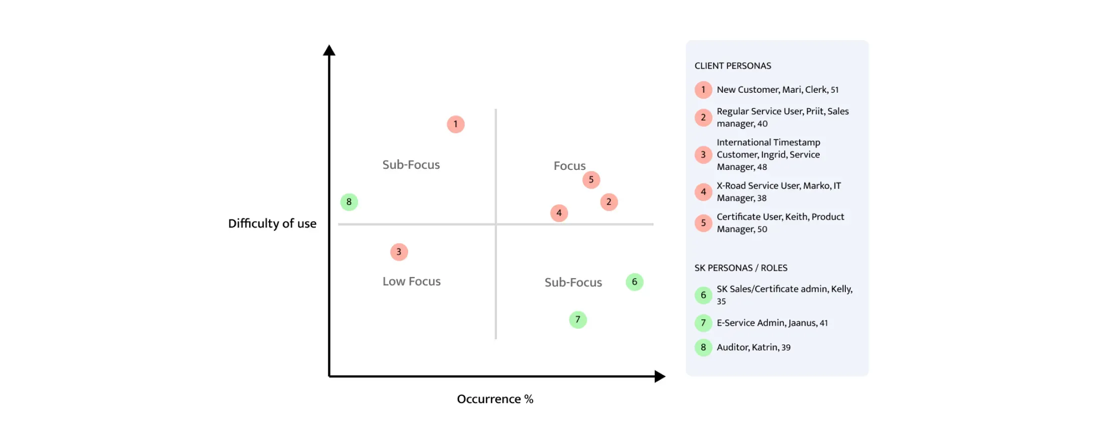
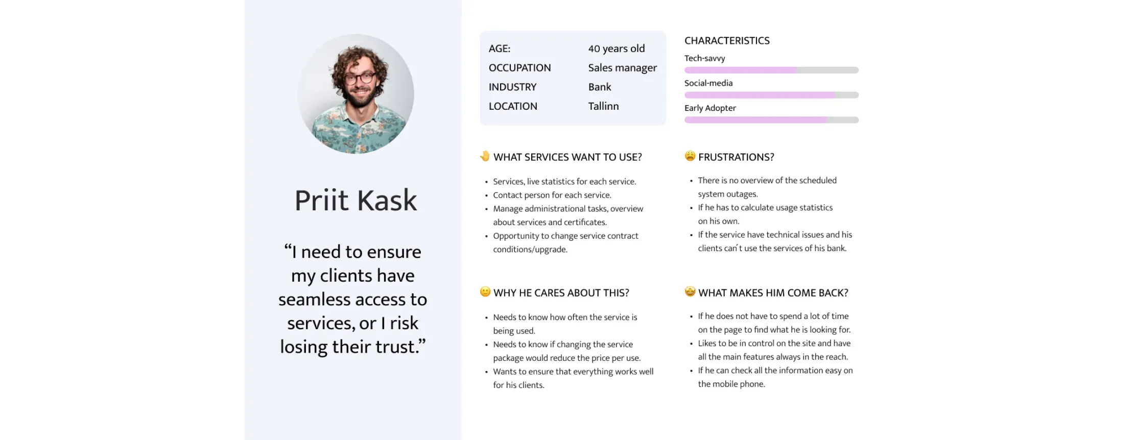
Diving deeper into user profiles
After analysing the interview data, I developed seven user personas and, through discussions with the client, established a priority scale to identify our primary users. Consequently, my design process focused on regular service users and customers utilising X-Road services to order certificates. I also recognised that the ordering process for new customers is currently quite challenging, therefore needed more attention.
Findings #1
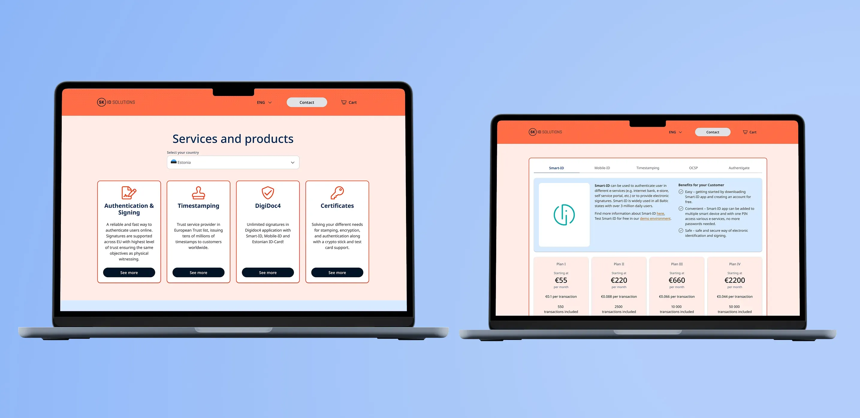
Unclear ordering process
Ordering services and products is unclear, pricing is hidden until signing, and the experience is frustrating for users.
Outcome #1
I separated products and services into cards and tabs, with each service showing an overview, transparent pricing, and detailed package information.
Findings #2
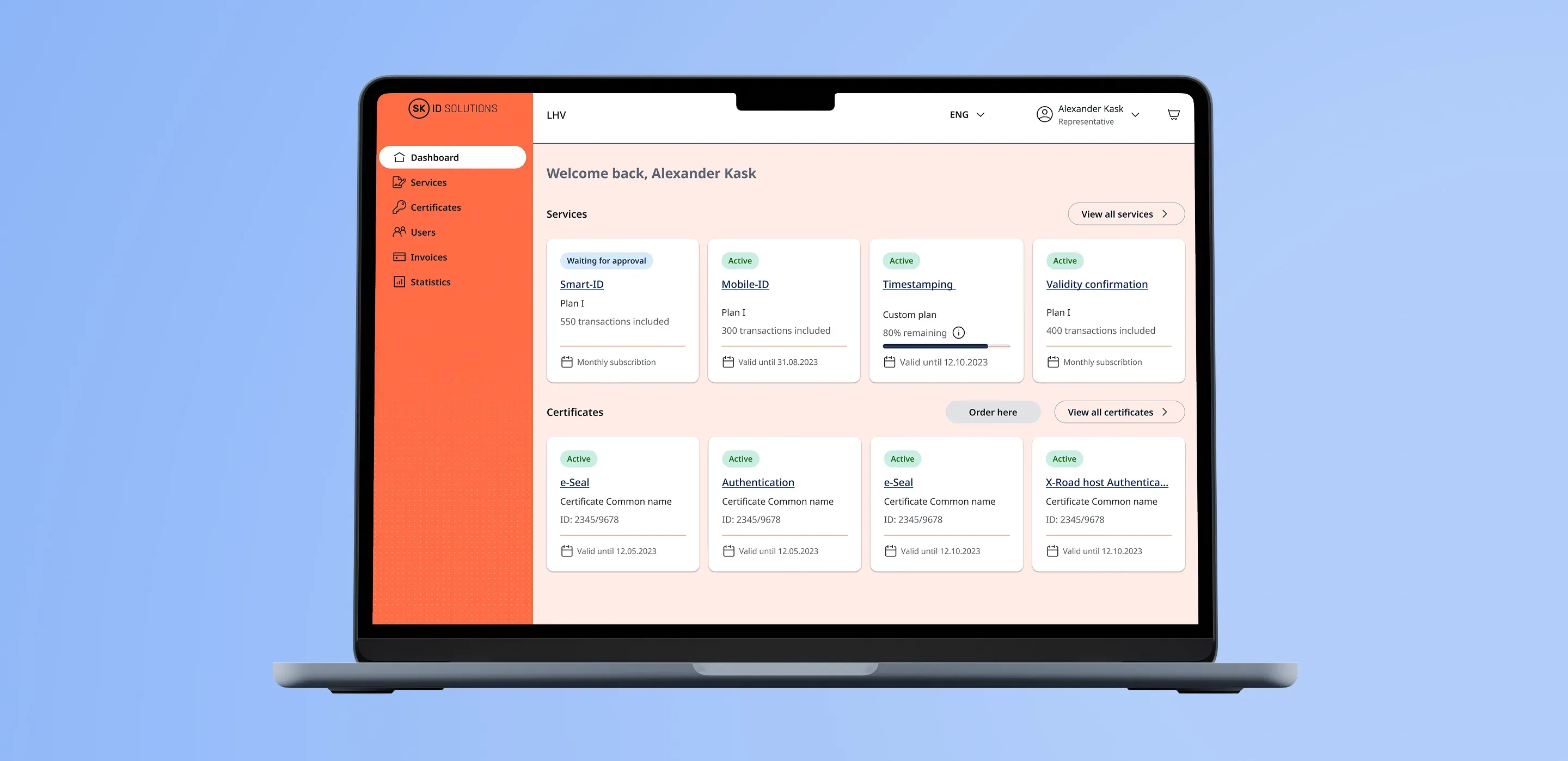
Customer dashboard lacks clarity
The customer dashboard lacked key information, such as service plan overviews and validation dates. Additionally, new products couldn’t be ordered directly from the dashboard, forcing customers to reorder through the website.
Outcome #2
I redesigned the service cards to show order status and plan usage, and added clear CTA buttons so customers could view details or order new services easily.
Findings #3
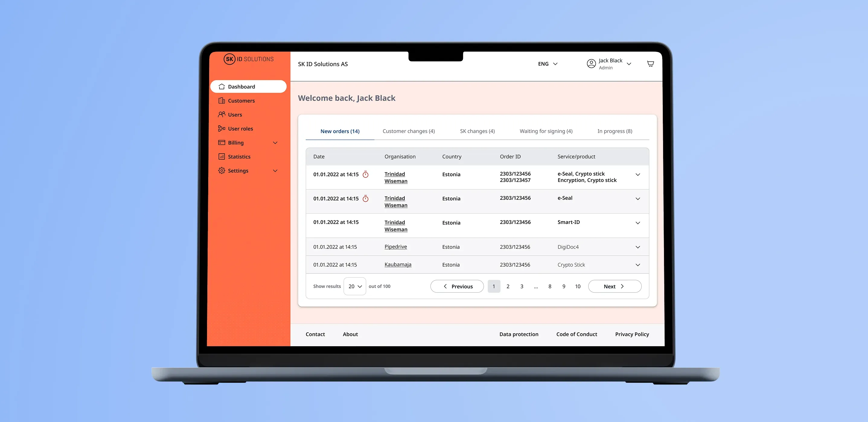
Customer management outdated
Customer management required extensive manual work across multiple systems, and support often had to assist users over the phone.
Outcome #3
I improved the experience by adding tabs for each order status and using visual cues to highlight important information and unread messages.
💎 Key learnings
- Every project is unique, and establishing the right workflow takes time. In our case, I discovered that involving a UI designer at the start of the analysis phase significantly sped up the design process.
- Clear and early communication is essential. Addressing doubts and issues as soon as they arise makes the entire work process smoother.
- In agile projects, it’s normal for the scope to change. However, both the design team and developers must learn when and how to say “no” to the client in order to maintain focus and prevent unnecessary delays.
- Engage with developers from the outset. In our project, the developers joined much later, which caused a disconnect between the design and development teams. Regular meetings with developers right from the start can prevent such misalignments.
- Document all design decisions and changes. This helps when revisiting designs and allows you to clearly explain the rationale behind any modifications.