
Project overview
The Alexela self-service app offers customers an integrated platform where they can manage various services. Customers can access features such as fuel refilling, electric vehicle charging, self-service payments, energy consumption/production tracking and billing management. Additionally, members can enjoy exclusive discounts and offers.
Project goal
Alexela needed a more intuitive and engaging app experience, which was affecting user engagement and loyalty. The goal of the project was to make core functions easily accessible, provide personalised discounts, and simplify account setup, payments, and service flows to increase customer satisfaction and encourage repeat usage.
Understanding the problem
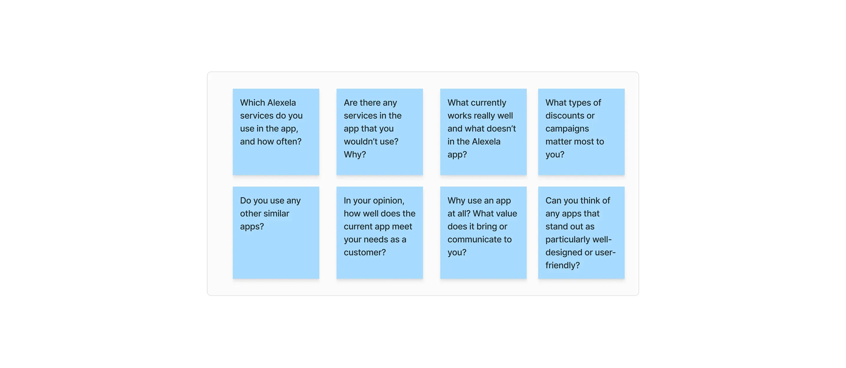
To understand the main issues with the existing app, I conducted 10 interviews with key stakeholders, including the Alexela marketing team, customer service, technical lead, business clients, management, and IT leadership. I also interviewed 5 customers who primarily used the Alexela app for fuel refilling and shopping at the convenience store.
Findings from interviews
Insights from my research revealed several key issues with the current app experience. Users often don’t understand what the app offers or how to use key services like fuelling, payments, or loyalty rewards. Terminology is inconsistent, and important features are hard to find. Many flows are confusing or unnecessarily slow, with actions like in-store payments or QR scanning not working smoothly. The app also lacks personalisation and doesn’t show relevant user data like discounts or service history clearly. A more detailed overview of the issues is listed below.
Design refinement
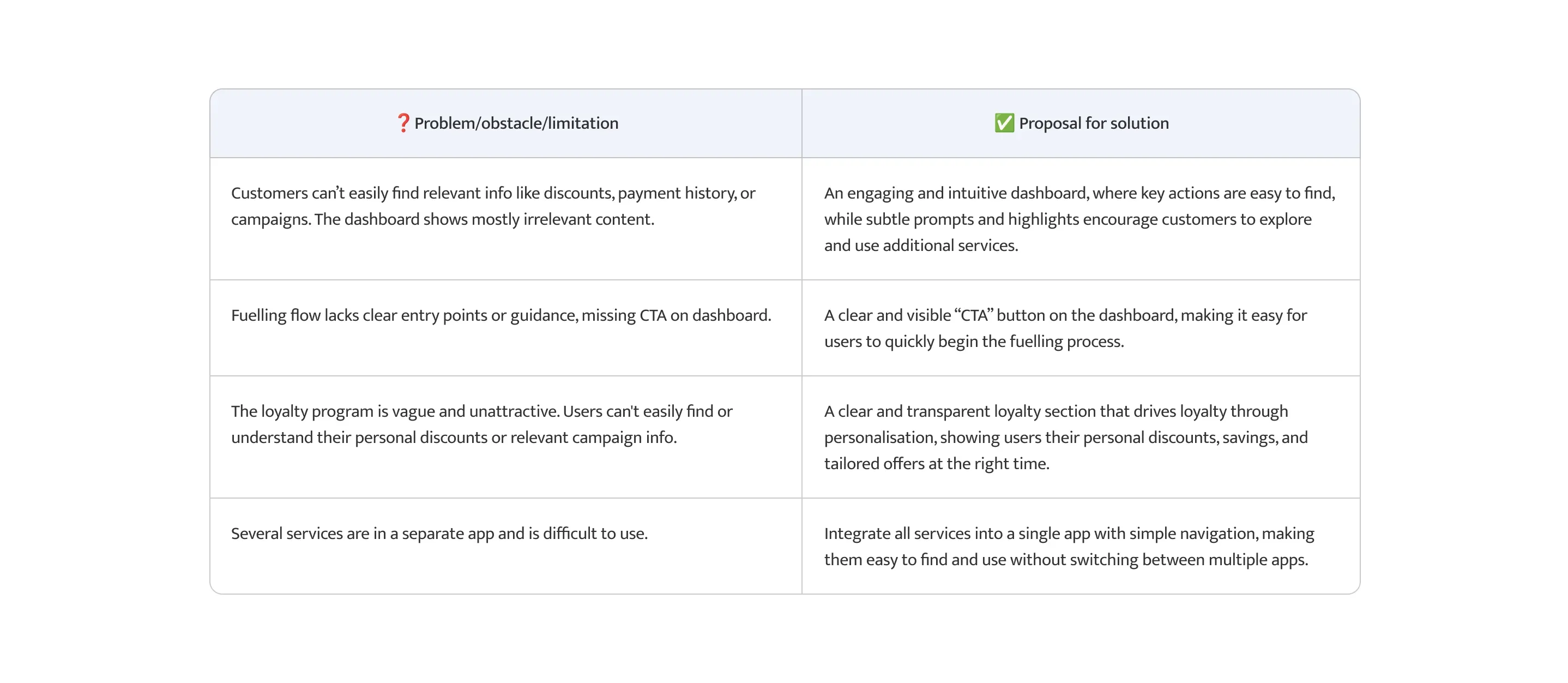
Overall, users want more control over when they add payment information, clearer access to key features, reliable scanning options, and better visibility of campaigns and discounts.
Findings #1
Campaigns & Discounts too hidden
Campaigns and discounts were buried deep in the menu or hidden within subpages, making them difficult for users to discover and access quickly.
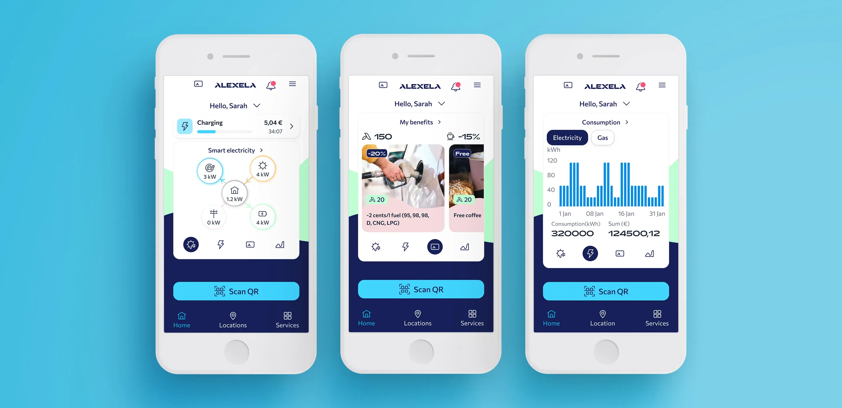
Outcome #1
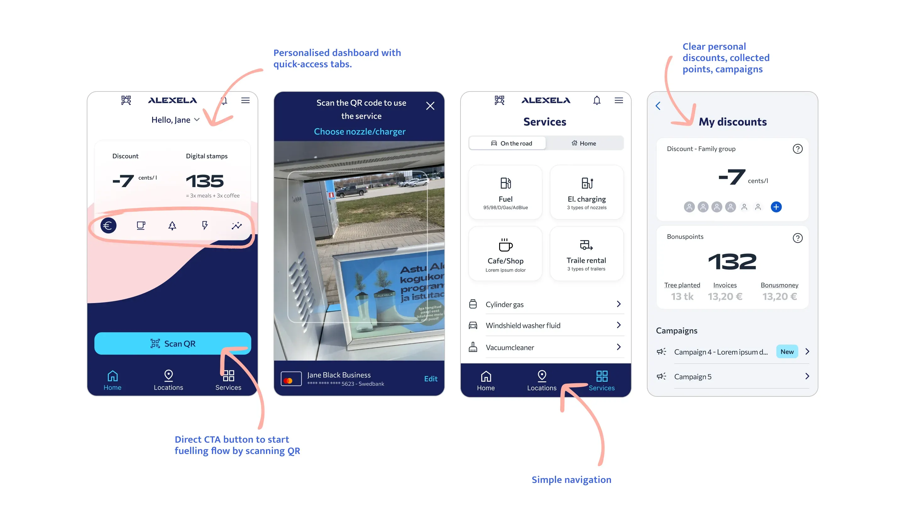
I redesigned the experience by introducing a centralised dashboard with quick-access tabs, displaying key information and making campaigns and discounts immediately visible. This allowed users to access the most important features directly from the home screen, reducing friction and improving discoverability.
Findings #2
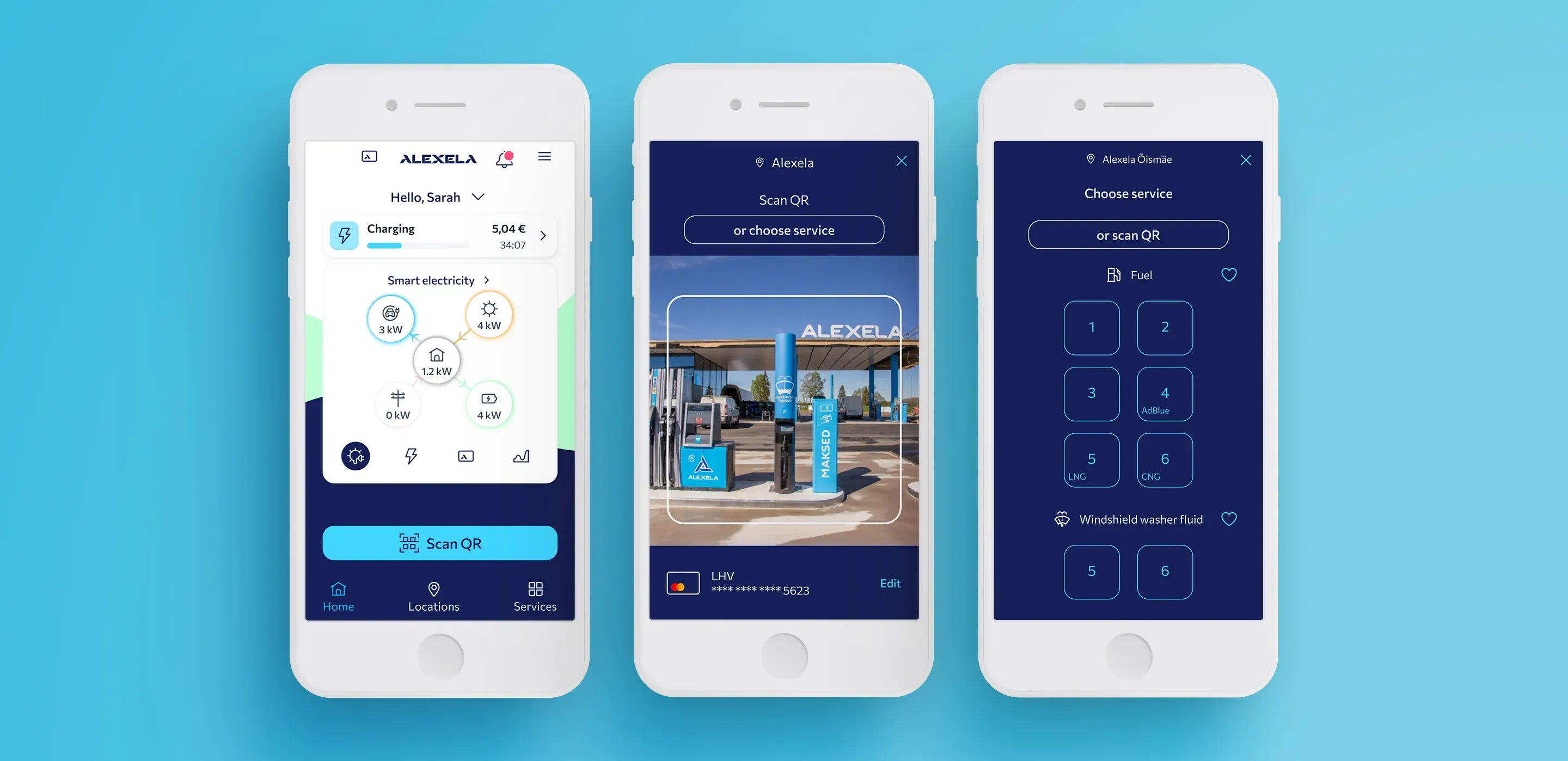
Alternative to QR code scanning
Not all users want to scan; some prefer to select the service manually. Scanning does not work for some users due to phone technical issues.
Outcome #2
I increased the visibility of the toggle button that switches from camera view to the services list, making the primary CTA clearer and easier to understand. Additionally, I improved the clarity of manual selection options by adding explicit labels, such as fuel type and electric charger type, helping users confidently choose the correct service without relying on QR scanning.
Findings #3
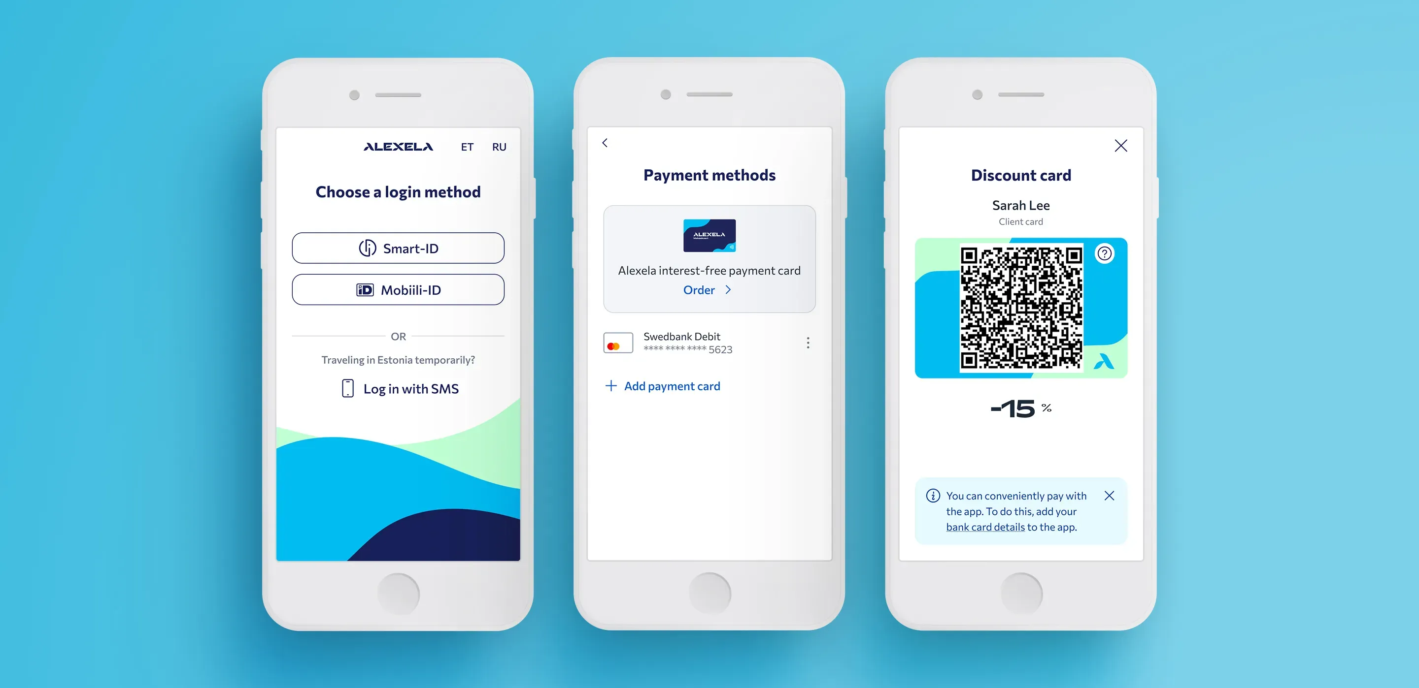
Improving the Login-to-Payment Flow
Payment card information was required immediately after login, which created friction in the onboarding flow. Users expressed frustration with being asked to enter payment details before fully accessing the app. They preferred to first complete registration, explore the app, and understand its value before adding their payment information.
Outcome #3
I removed the payment card step from the login flow to make onboarding smoother. Instead, I added a friendly reminder that encourages users to add their card later. This allows users to access the app first and enter their payment details when they are ready.
Findings #4
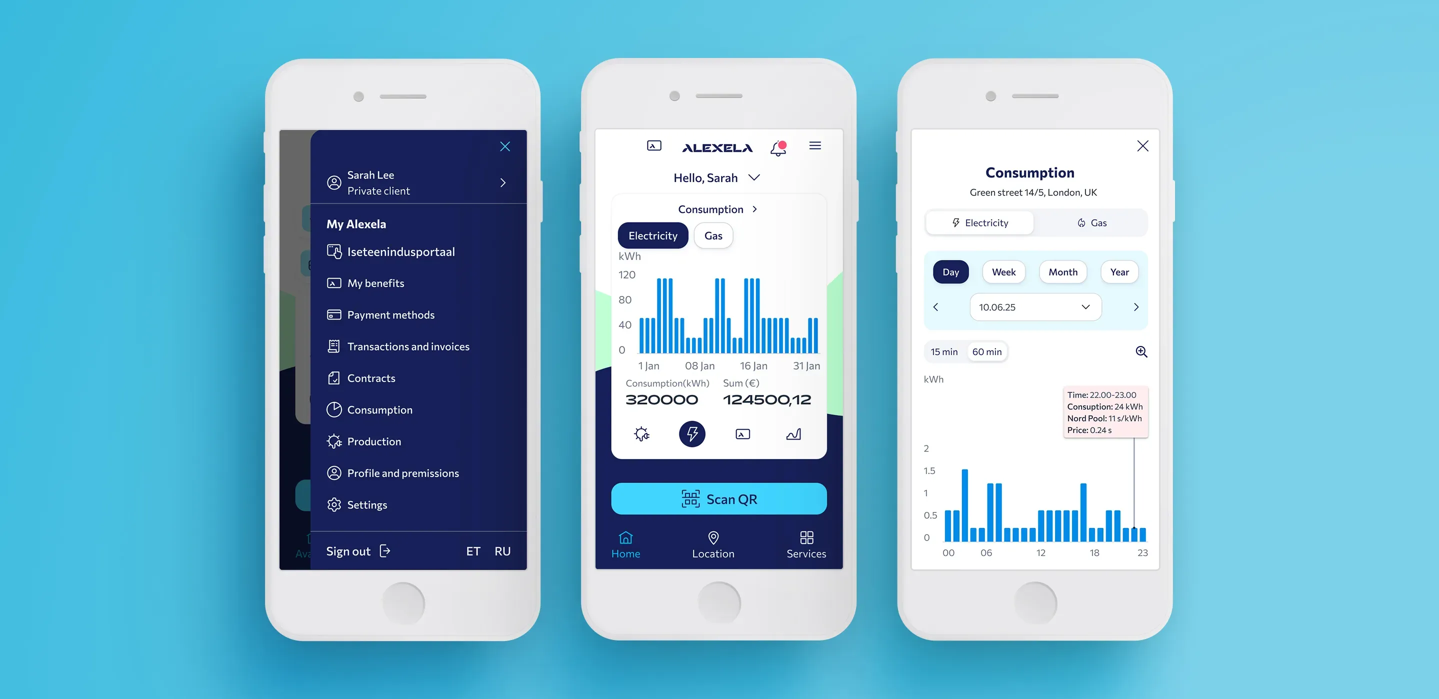
Making Account Information Discoverable
The detailed view of transactions and contracts is hard to find. Some menu elements (e.g., the “loyalty card” icon, statistics) are unclear and confusing.
Outcome #4
I reorganised the menu into a logical structure by grouping related content. All customer-focused features, like “My Benefits” and “Payment Methods”, were placed under “My Alexela”, while other information, such as “Electricity Prices”, “Community”, and “Contact”, was separated into distinct sections. This ensures that everything related to the user’s core tasks is easily accessible in one place. Additionally, I made key customer information quickly accessible directly from the dashboard.
💎 Key learnings and challenges
- Finding balance for a diverse user base is challenging. The audience includes older, less tech-savvy users as well as younger, tech-friendly users, requiring a design that works effectively for both groups.
- Technical challenges of the app are complex. Because of the intricate system and database, not every design idea is technically possible. This means solutions often need to find a compromise between what is ideal in design and what can be realistically implemented, balancing functionality, usability, and feasibility.
- The project involved two external development firms, which made communication more difficult. At the start, it wasn’t entirely clear which firm was responsible for what. During the project, we began holding weekly meetings with both firms, which sped up the work process. We also organized quick calls and separate meetings with just the developers whenever necessary.